


Ranking Premier League away kits for the 23/24 season
- Golnar Jalinous
- Aug 3, 2023
- 3 min read

Now that we’ve rated the new home kits, it’s only right that we rank every Premier League teams new away kit for the upcoming season:
Arsenal

(Image via the club)
Arsenal loves to be more creative when it comes to their away kits. Last season they rocked the dark-pink look, and two seasons back it was neon yellow. This time, Arsenal chose to rock two colors: neon yellow/green with black swirls. It’s pretty ugly, usually the Gunners nail their away shirts, not this year.
Grade: C-
Aston Villa

(Image via the club)
It’s basically the home kit but in white. I like the background with the lions that have been the team mascot since 1874. It’s a solid jersey, but the new Aston Villa logo is awful.
Grade: B
Bournemouth

(Image via Umbro)
I like the concept with the wavy lines, but why is the jersey all blue? The lines, the background, and sponsor, and the badge are all blue. It’s kind of an eye sore. The design is cool but it shouldn’t be ALL BLUE.
Grade: C
Brentford
(Image via the club)
It’s not as bad as the Bournemouth kit, but it’s still one color. Jerseys can’t have the badge, sponsor, and theme be one color, it makes it look messy. I do like that shade though.
Grade: C
Brighton

(Image via the club)
Now this is quite something. Green and black definitely don’t go together, but for some reason I like this kit. I don’t know what it is but the green and black work for some reason, it just feels like a Brighton kit, don’t ask why!
Grade: B+
Burnley

(Image via umbro)
Yellow with a brown line on the side, who told Burnley this is a nice kit? I didn’t like their home kit because I thought they put no effort into making a cool jersey, but this is just hideous.
Grade: D
Chelsea
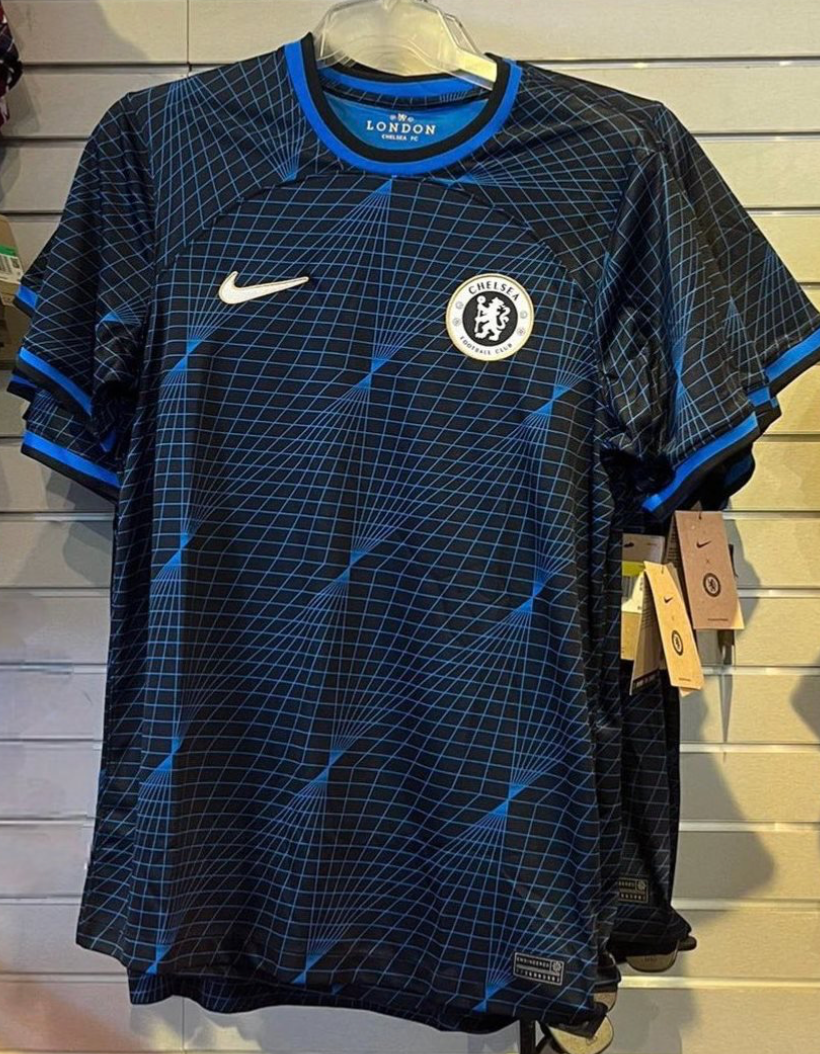
(Image via twitter)
It’s not official, but if this is Chelsea’s new kit for this season, it’s fine, but like I said, without a sponsor on the front of the jersey, it looks like a training shirt. It’s also one color but the wave-look suits the shirt.
Grade: C+
Crystal Palace

(Image via the club)
I like it, it’s a little basic with the white and blue sash, but it’s a quintessential look. This jersey screams Crystal Palace!
Grade: B+
Everton

(Image via the club)
This is so abysmal. The orange with the strange blue stripe design does not go together. Everton deserves to be relegated because of this jersey!
Grade: F
Fulham

(Image via the club)
The pink is so bright. It hurts my eyes to look at this jersey. I liked their home kit, but I’m disappointed in Fulham’s away kit, it just doesn’t cut it.
Grade: D
Liverpool

(Image via the club)
I really like the white with green boxes diagonal from each other. It’s different from previous looks, but it works big time.
Grade: A
Luton

(Image via the club)
It’s their away kit, but switch the colors so the main color is white and the stripe on the side is orange. No creativity, unfortunately.
Grade: C
Manchester City

(Image via the club)
Well it’s TBD on the away kit, so I’ll rate the third kit! I like the light blue lighting on the kit along with the pink color for the badge, and sponsor. The lightning symbolizes City’s electrifying style of play, and with Haaland in the team, I expect City to blow away the competition again this season!
Grade: B+
Manchester United

(Image via the club)
This has got to be one of the worst jerseys I have seen United release. Their third kit is so much better looking and it’s more like their away jersey than this monstrosity. United should make their third kit and their away shirt, and this jersey should be their third kit.
Grade: F
Newcastle

(Image via the club)
It’s alright, but it’s all green. It definitely looks like Saudi Arabia designed this kit. That’s not a bad thing, I just think it needs more going on.
Grade: C
Nottingham Forest

(Image via the club)
The blue swirls are a nice touch and even without a sponsor this shirt is nice. I have nothing else to say really.
Grade: B
Sheffield United
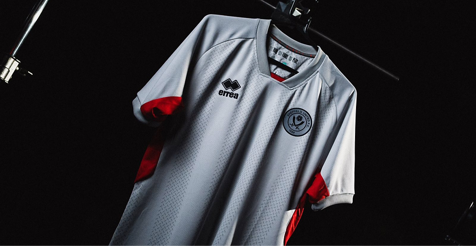
(Image via the club)
They are yet to release their away kit so let’s rate the third kit, it’s all white.
Grade: D
Tottenham

(Image via twitter)
The kit hasn’t been released officially but we have pictures of the leaked kit. I like the color but it’s all dark colors. At least Spurs added different shades of the dark black color. Tottenham just love releasing one color shirts. Nike has to do better next season.
Grade: D-
West Ham

(Image via the club)
Again, no official kit yet, but the leaked jersey is all white and boring.
Grade: D-
Wolves

(Image via the club)
I like this shirt. The all red with the green shoulders is a cool look. All summer I have been hating on Wolves summer transfer window, in my table predictions, and when ranking their home kit. FINALLY, I love something related to wolves!!
Grade: A


Comments